The first time we realized that Aurel Schmidt’s media presence would be chronic was months ago. At our favourite magazine spot, amongst the numerous overdone magazines lying on the shelves, the simplicity of the June 2009 cover of Border Crossings appealed to us. A nouveau-genre smiley of half-eaten doughnuts and a bunch of cigarette butts was staring intensely. A strong media magnet was underlying the representation; a future favourite of the cultural set was hiding behind the cover.
Nowadays, it seems that one can’t go through a magazine without stumbling on the ever-present artist Aurel Schmidt. This month only, a glimpse at our favourite magazines made us feel like members of Schmidt’s fan club. Tokion, AnOther magazine and Purple all graced us with features implying the Canadian-born NY-based artist. Happily for us, we kind of like her irreverent and slightly trash media persona. Schmidt is part of something greater than the visual art field. She’s now part of our media visual culture, her opinions are valued («AnOther thing I wanted to tell you» on Spank Rock) and her persona glorified. But can we draw a line between her art and her mediated life? Not really. Her art extends from canvases to her own representation in the media culture. The interrelations between her self-representations and her art are strong. The resulting mingle leaves us mystified and unable to decide of a definite border between the art and the artist.
Although art historians would damn us for such a statement, we consider that she uses the media as a platform to perform relational art. An artist of Bourriaud’s esthétique relationelle? No! They open Indian restaurants and «double clubs», they’re not simply portrayed on glossy paper. But we strongly think that the media induces a connection between the content and the viewer in a two-sided relation of reception and retroaction. As Warhol proved decades ago and Matthieu Laurette more recently, a media sphere intervention by an artist is intrinsically linked to his art and practice. For these reasons, we can’t consider the media presence of Aurel Schmidt as a collection of simple features, but rather as an art that went from its traditional form to the street, and then, to the magazine.
Inspired by the themes explored in her paintings, she took the street as a medium and created an in-situ installation (Deep Throat) made of empty beer cans, cigarette butts and other patterns frequent in her artworks. Purple Fashion magazine then photographed Schmidt dressed in her favourite artistic themes for their Spring-Summer 2009 issue. The spread shows a daring Schmidt in the midst of several distinctive objects recalling her art: necklaces made of doughnuts or cigarettes, beer cans, etc. This embodiment of her practice for a photo shoot is not only a fine concept, but also a statement on the inseparability of her media persona and her art. Indeed, Purple reaffirms that Schmidt’s media presence is a medium for her artistic practice. By doing so, they also imply that her body is a canvas for her artworks’ subjects and themes.

This new signification of the artist’s body, not far from the issues tackled by the post human movement, involves that Purple’s conceives Schmidt’s body as a space of artistic significance. An assertion reinforced by Purple’s last issue (Fall-Winter 2009), where Schmidt’s tattoo (a garter snake) is analyzed through an interview with the artist.
Olivier Zahm: Are there snakes in your artworks?
Aurel Schmidt: In my older work I drew a lot of snakes.
Our answer: From the canvas, to the street. And from the magazine to her body, Aurel Schmidt’s art is multiform. Are there snakes in her artwork? Yes, whether they are drawn on paper or tattooed on her skin.
Pictures (in order):
Purple Fashion magazine, Spring-summer 2009 - Vol. III, Issue 11
Aurel Schmidt, Burn outs, tinyvices.com
Aurel Schmidt, Deep Throat, tinyvices.com
Purple Fashion magazine, Spring-summer 2009 - Vol. III, Issue 11
Purple Fashion magazine, Fall-winter 2009 - Vol. III, Issue 12
From Cindy Sherman and Rirkrit Tiravanija to Vanessa Beecroft and Jeff Wall, contemporary artists transformed Visionaire magazine into the flesh of art. The resulting tension between the generic magazine’s nature and its new function as a medium changed once and for all our rather fickle line drawing game; these artists made media and art become one. Along with Visionaire’s team, they scrubbed the frontiers between both spheres and ended the everlasting debate between authenticity and reproducibility. Yes, we’ve reached the Laocoön of our time. Editors act as curators, a magazine has it’s own monograph and exhibitions are being held to consecrate the object. The involvement of a self-reflexive art completely reshaped the magazine’s form and enriched the sensory experience given by the object.
And that’s where Visionaire proves that we were wrong. Mea Culpa. Our judgement was distorted by our fear of networks and dematerialized medias. Like all the coated paper junkies out there, we were afraid that our beloved magazines would disappear only to be replaced by screens, interfaces and impersonal megabits. But Visionaire embraces its materiality and emerges as the antithesis of those trends. Is contemporary art the future of magazines? A future made of sensual materiality and pleasure-giving forms? Is art the way to highlight what the magazine has always been in an embryonic form, i.e. an object of aesthetic experiences? Long before the word «magazine» was created, similar publications were named «Museums». It’s a powerful semantic sign that the self-proclaimed «Visionaire» accomplishes the underlying intentions of magazines, what they were always meant to be.
Editor’s note: This post is inspired by the copyrighted theoretical essay «Magazine Visionaire : de la récurrence singulière et des multiples insolites. De media à medium de l’art.» (Visionaire magazine: the singular recurrence of unusual multiples. From media to medium of art.) All rights reserved to Zeitgeber & Meme’s editor-at-large. ©
Pictures: The Wall Street Journal ©

When we saw the pictures of the too-hip-it-hurts couple du jour by Terry Richardson for the last edition of the biannual cultural bible, we were simply blown away by the excellence of the intrinsic photographic qualities. Composition, lighting, framing and even the subtle colour palette all worked together to create a great moment in the art of image making. The portfolio in itself is a tour de force, but when we stumbled across the remake of the famous foetus-like picture of John & Yoko by Annie Leibovitz we just fell once again for the genius of both Purple and Richardson. Re-enactment is a common strategy in contemporary photography. Richard Avedon did it’s own version of Munkacsi. Melvin Sokolsky fashioned it’s own interpretation of Velasquez’s legendary Las Meninas. But this time, ramifications are complex, plural and multidisciplinary in scope. Questions emerge from the choices made by the photographer and the creative direction. The iconography of the picture connects the figure of Sean to the one of his mother. Is there a connection between the mother and son that goes further than the composition? Why is he playing the role of his mother? Is it personality and spirit related?
Our guess? Pictures might be symmetrically inverted in composition, but the ins and outs remain unchanged. The figure of the woman stays the dominant one regardless of the positioning of the bodies. John Lennon looks emotionally fragile and reliant to his wife Yoko, placed higher in the composition and tenderly «looking after» her soul mate. In the re-enactment, Charlotte Kemp is now the woman perched higher and looking at Sean Lennon who’s waiting for the expected kiss. Kemp might be reproducing the positioning of the father, but she looks nothing like him in essence. She’s the femme fatale, the dominant persona of the picture.
Purple re-enacts a picture, inverts the bodies’ position and keeps the gender-related roles intact. A three steps reconstruction-deconstruction process that reaffirms why Purple Fashion and Terry Richardson are the vanguards of contemporary photography, publishing and fashion.

Sean Lennon & Charlotte Kemp, portrait by Terry Richardson, Purple Fashion FW09, p.106
Sean wears a shirt by Hermes and pants and bowtie Turnbull and Asser
All rights reserved
- © -
John Lennon & Yoko Ono, portrait by Annie Leibovitz, Rolling Stone magazine
All rights reserved
- © -
We read a lot of fashion magazines, and rare are the occasions where we’re totally astonished by a feature or a section. By photographs and graphic design. Yes. By the «10 hottest trends of the season». Not really. But then comes the magazine that makes you wrong. We just got our hands on the latest issue of Fantastic Man and we’re astounded by the overall quality of the publication. Not only the photographs, the design and the layouts are remarkable, but the writing is witty, clever and sharp. Our favourite section? The Recommendations for this season. The autumn-winter 09 issue recommends Shooting Gloves, a Personal Assistant, Absence, K-Y JELLY and the use of the word «LIKE», etc. All recommendations are made by personalities, from a fashion correspondent to a professor of linguistics. Here at Z&M, we’re thinking about applying all the recommendations to our lives and wait for enlightenment. In the mean time, follow Fantastic Man’s daily recommendation on the magazine’s website.
Are you magazine obsessed? Are you art-driven? If you’re aware that there’s a gap between Visionaire and Chatelaine, that a magazine is sometime an object of analysis that contains the imaged substance of an avant-garde world. If you’re aware that a magazine may be an embryo of the future advancements in our way to create and to make images, then CV83 is a must. This issue of Ciel Variable is largely dedicated to the influence of both art and artists on the visual aspect of magazines. From auto reflexive creations to artistic post-interventions, the mingling between art and magazines creates the most extensive source of artistic expression of our century. With this in mind, art historians and people in general are more than welcome to see what’s beyond the glossy paper.
With artworks by Hans-Peter Feldman, Christian Boltanski, Michael Snow, Ron Terada and essays by Adam Carr, Zoë Tousignant and others.
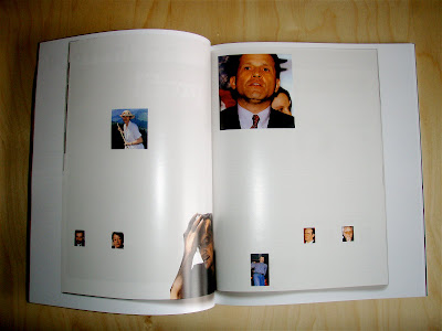
Hans-Peter Feldman

Hans-Peter Feldman
Copyright
all the texts on this SITE Ⓒ 2009 Zeitgeber & meme. ALL OF THE texts HEREIN, UNLESS OTHERWISE NOTED, ARE COPYRIGHTED. NO text OF THIS SITE MAY BE USED OR REPRODUCED IN ANY MANNER WHATSOEVER WITHOUT EXPRESS PERMISSION OF THE COPYRIGHT HOLDER(S).


 Posts
Posts

